![SM_Platform-logo.png]](https://support.sitemanager.io/hs-fs/hubfs/SM_Platform-logo.png?height=40&name=SM_Platform-logo.png)
Our styled content components need to be checked for responsive consistency, just like our previous checks: general styling and design layout elements.
Once again we are going to check the style properties for our 4 viewports. Click the style icon of the page component and browse to the property you want to change.
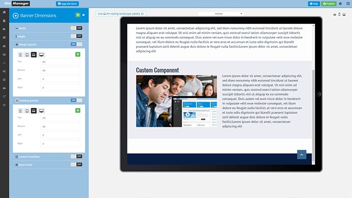
Large Desktop View
Click the desktop icon in the style panel.
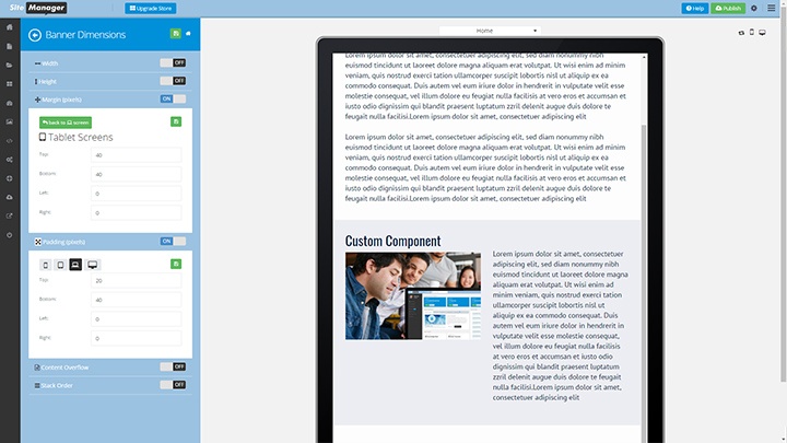
Tablet View
Click the tablet icon in the style panel.
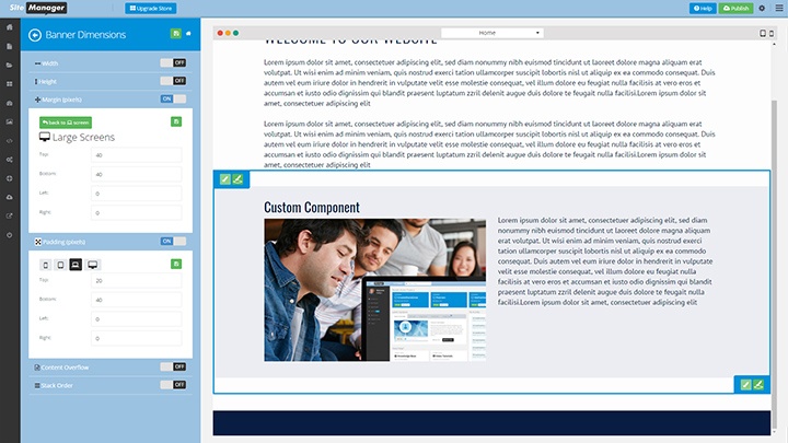
Laptop View (standard)
Click the laptop icon in the style panel.
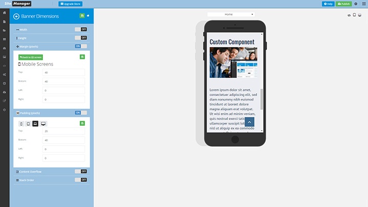
Mobile View
Click the mobile icon in the style panel.