![SM_Platform-logo.png]](https://support.sitemanager.io/hs-fs/hubfs/SM_Platform-logo.png?height=40&name=SM_Platform-logo.png)
Before you continue adding more content and create different layouts it's important to check how your website looks on all devices and different screen sizes. This part is known under the popular term responsive web design.
We are going to check the general style, the layout design elements and the page content components.
First we start with the general style of our website.
Design editor
Go to the design start page and click the edit button of the content layout.
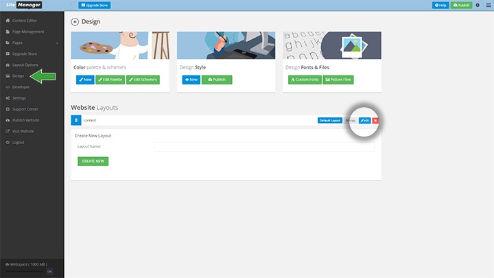
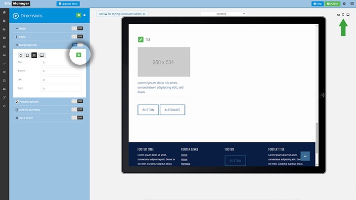
The design editor will open with the placeholder render. In the content section we see the general style elements. We click the green paintbrush style button.
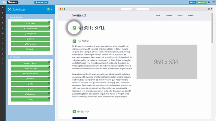
In this example we will check the bottom margin of the tile element.
Large Desktop view
Every style property will have 4 viewports (mobile, tablet, laptop, large desktop). The style property will open with the standard laptop icon selected.

The preview screen starts with the view for large desktop screens (when viewed on a large desktop screen min-size 1920x1080).
Clicking on the desktop icon will open the properties for this viewport. Click the green save button to update properties for this screen size.
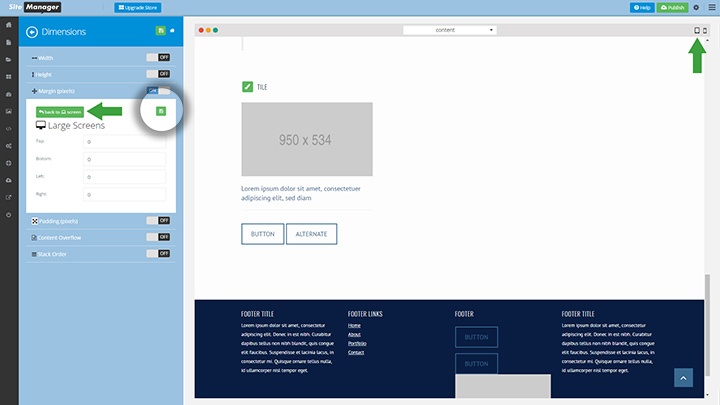
To go to the tablet view click the tablet icon on the top right of the render screen.
Tablet view
Click the tablet icon in the style panel to open the tablet properties. Making changes here will only affect when the site is shown in tablet portrait mode.
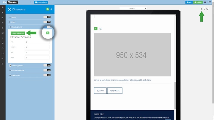
To go to the laptop view we will switch the view of the tablet to landscape mode.
Laptop view (standard)
The style properties standard view is this viewport: it fits for landscape tablet and laptops alike.
Click the green save icon when you are done making changes before going to different viewports.
To go to mobile view we click the smartphone icon on the top right of the preview screen.
Mobile view
This is a very important view because mostly content will look very different (stacked) then on the other devices.
Click the mobile icon in the style panel to open this view.
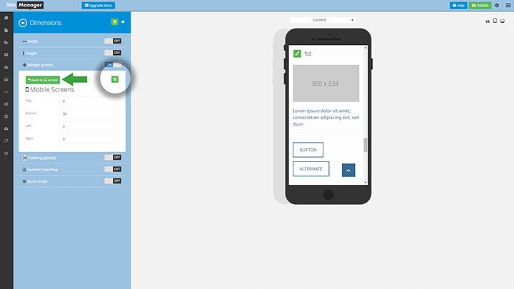
Because the tiles are stacked on mobile we are going to add 30px to the bottom margin so they don't stick to eachother.
learn more about mobile styling: http://knowledge.sitemanager.io/sitemanager-design/design-editor/mobile-styling