![SM_Platform-logo.png]](https://support.sitemanager.io/hs-fs/hubfs/SM_Platform-logo.png?height=40&name=SM_Platform-logo.png)
Structure blocks are a relatively new feature in our design engine that allow you to logically organize a collection of elements inside your component, similar to how you would group elements that belong together in design tools such as Figma or Photoshop.
In this article
In this article, you'll learn how to add structures to your web page. If you want to learn more about what structures are, check out this article here.
Add a structure to your section
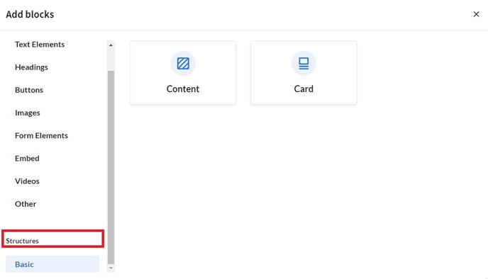
To incorporate a structure inside your landing page, simply add a section by clicking the plus icon in between two sections and select Design component. Next, SiteManager will prompt you to add blocks. These blocks can either be Elements or Structures.
Select one of two types of structure blocks: a basic Content Structure or a basic Card Structure.
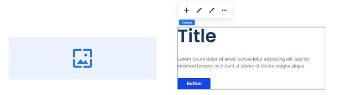
A common component, in which structures are often used, is Image w/ Content with an Image element on the left, and a Content Structure on the right. If you need any other elements for your component, now is a good time to also add them.
Style your section
Once your Content Structure or Card Structure and any other elements are added to your section, it is a good idea to start styling your section before you add any content.
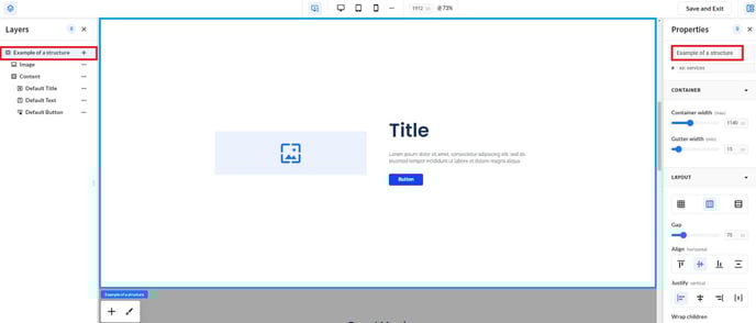
First, expand the Layers panel on the left side to maintain a clear overview of all elements. You should automatically be on section level, which is the highest level. Next, set the section layout to either Grid (default), Horizontal Flex or Vertical Flex in the Properties panel on the right.
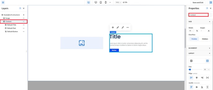
Add content to your structure
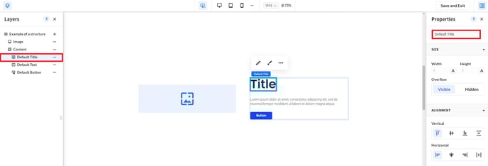
Now, add elements to your content structure by clicking the plus icon. This is similar to how you added elements to your section earlier. Frequently used elements are a Default Title, Default Text and a Default button.
Style your component
Unique to structures, is that you can apply layout settings on section level, component level and element level.
After adding content to your structure, you can add styling. Simply switch to component level in the Layers panel on the left side and adjust the layout settings in the Properties panel on the right.
Style your elements
Finally, you can also add styling to each separate element inside your Structure.