- Knowledge Base
- Design
- Design editor
How to style your website?
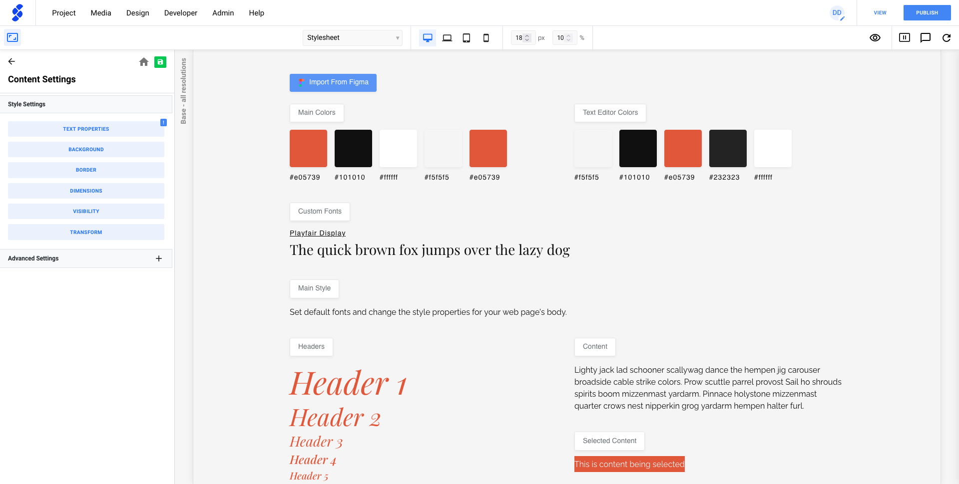
Global Stylesheet
The global Stylesheet serves as a reference point for setting default styles. Whenever you add a component from the library, or create a new one, the default style from the global stylesheet will be used.
The Global Stylesheet provides an overview of various elements such as headers and buttons. Additionally, you have the flexibility to define your color palette.
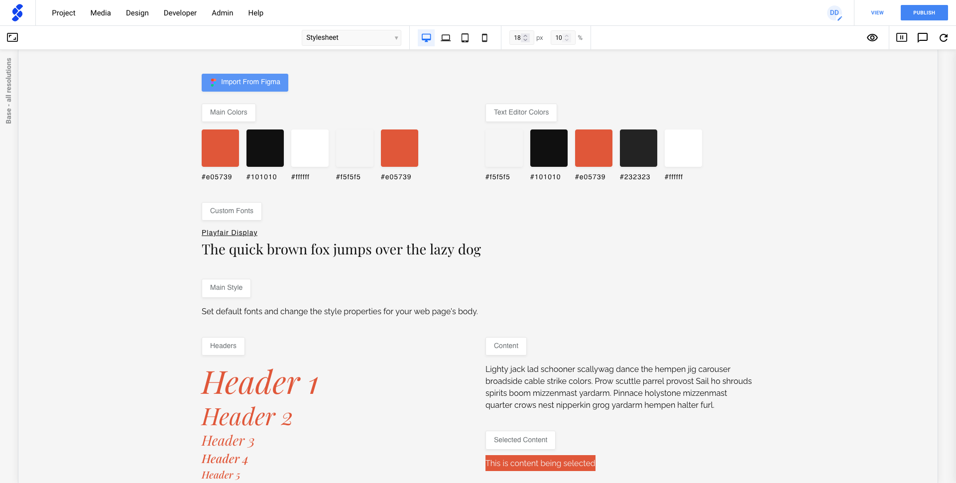
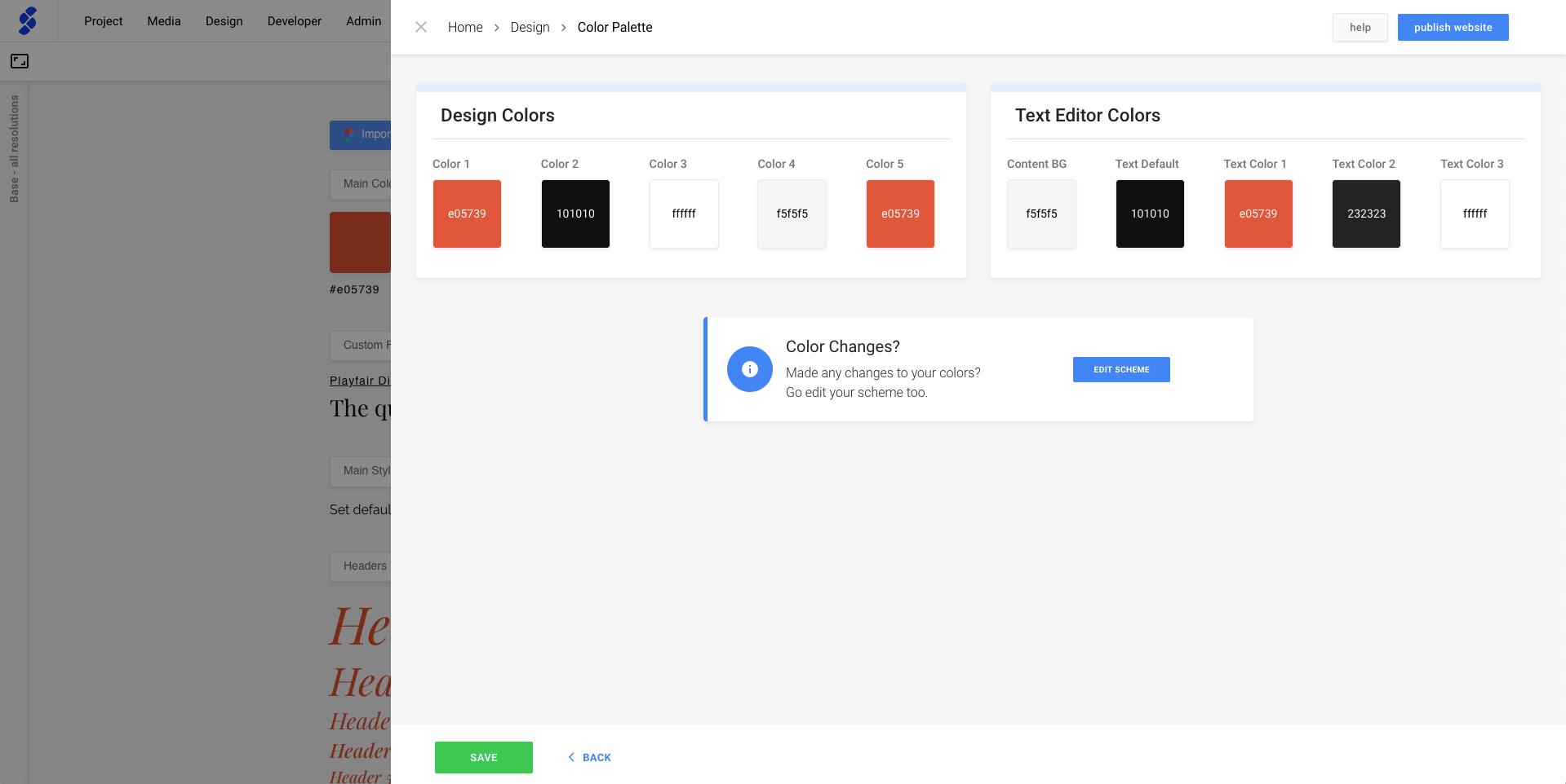
When we click on Main Color button, a panel will open that allows you to change the colors to your preference.
Other elements such as Content will show you additional design panels to change up the styling.
Component styling
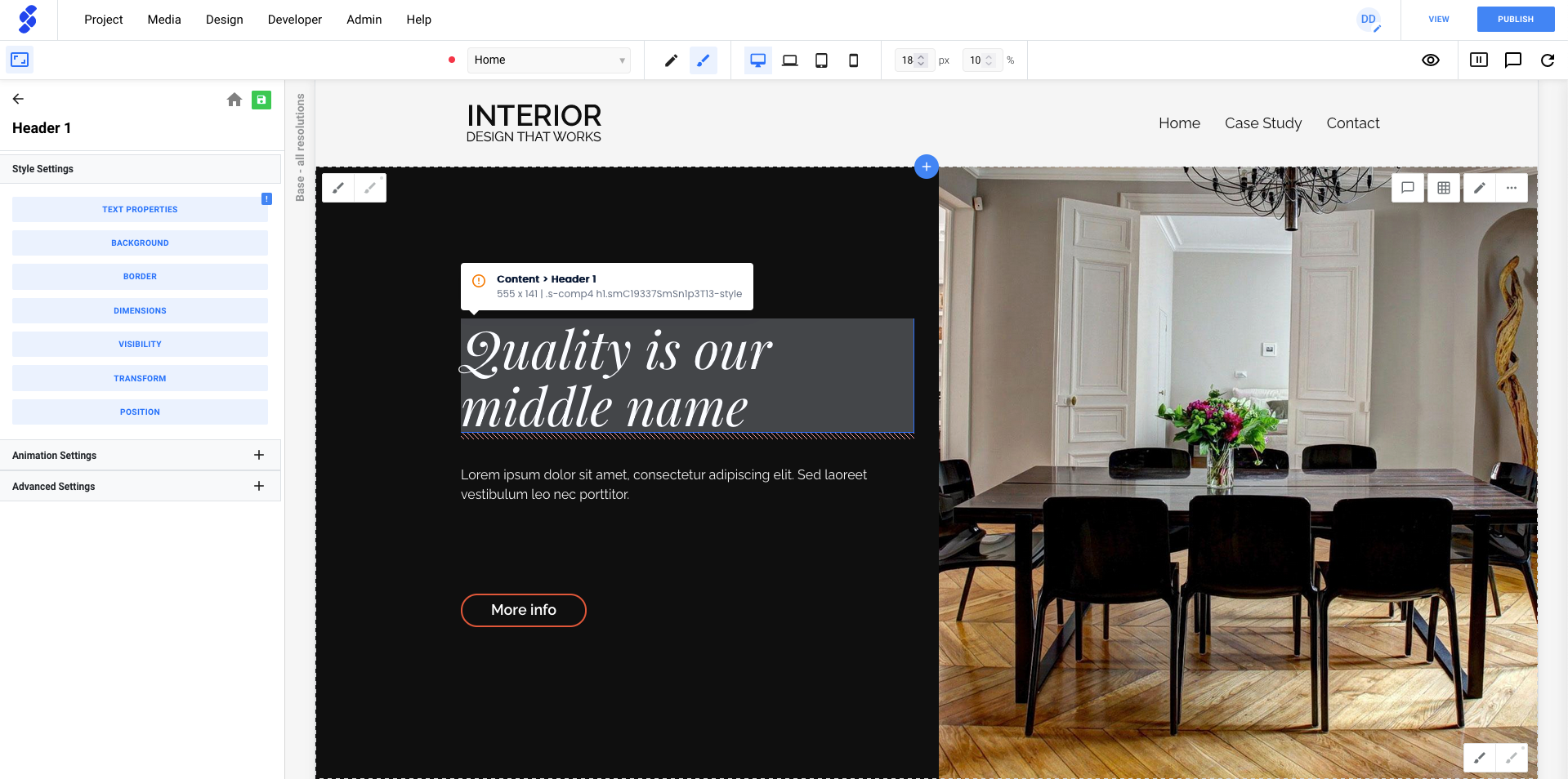
To customize the styling of a component, simply click on the pencil icon. This will show you the design panels that you can use.
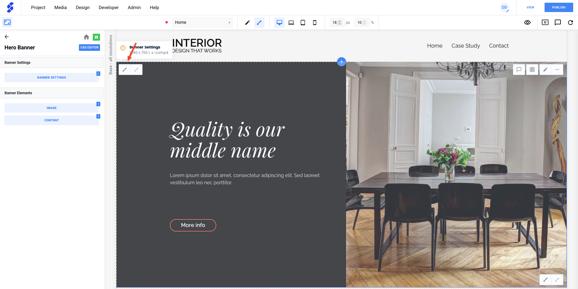
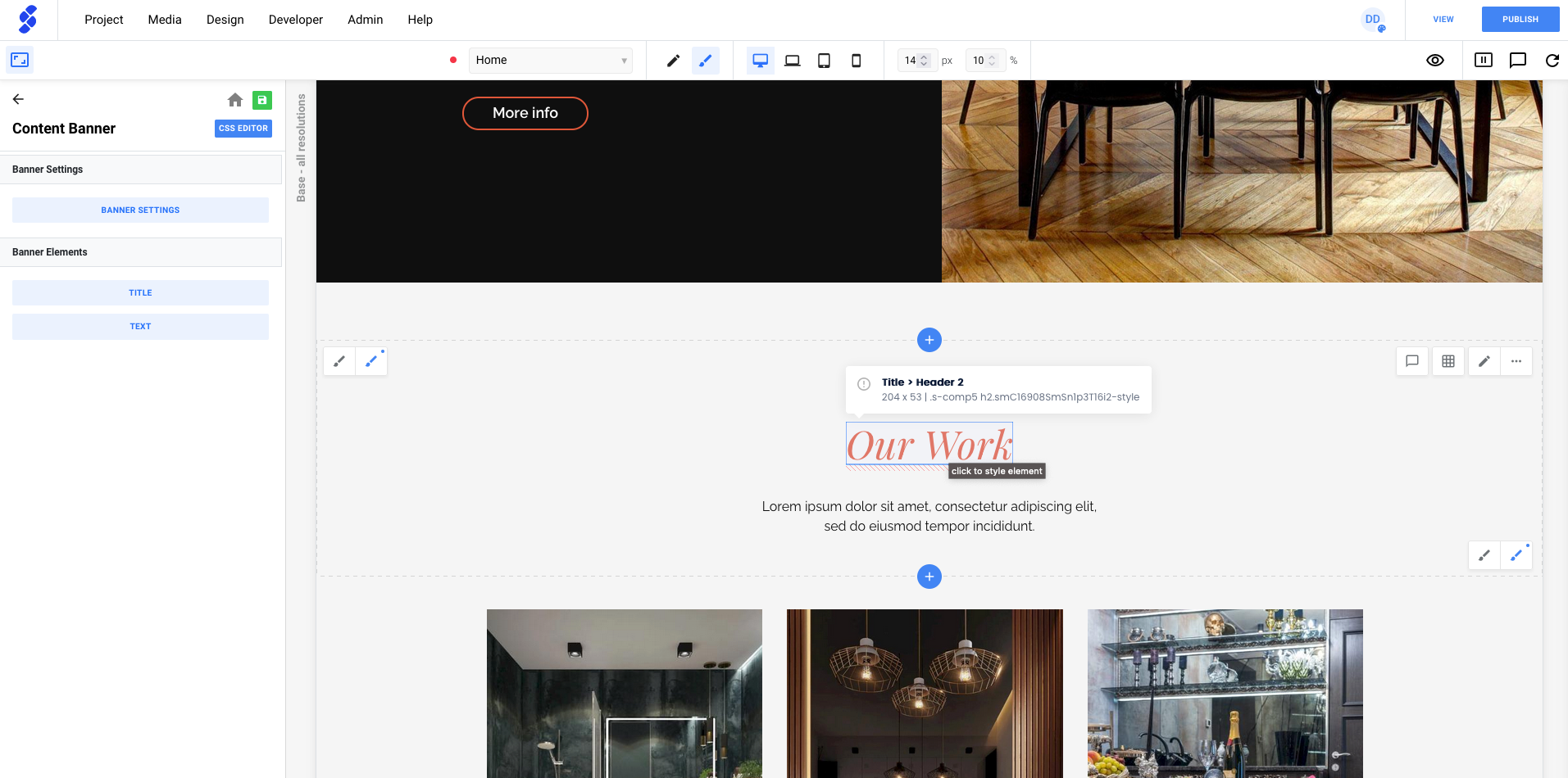
If you want change the style of an element such as a title, you can click on the title to instantly open the design panels. You'll now see the properties we can change.
Instance styling
If you have a component that you use multiple times on your page, you may occasionally want to customize only one of them with, for example, a different background color.
By creating an Instance of the component, any style changes you make to that specific instance will not affect the other instances of the component.
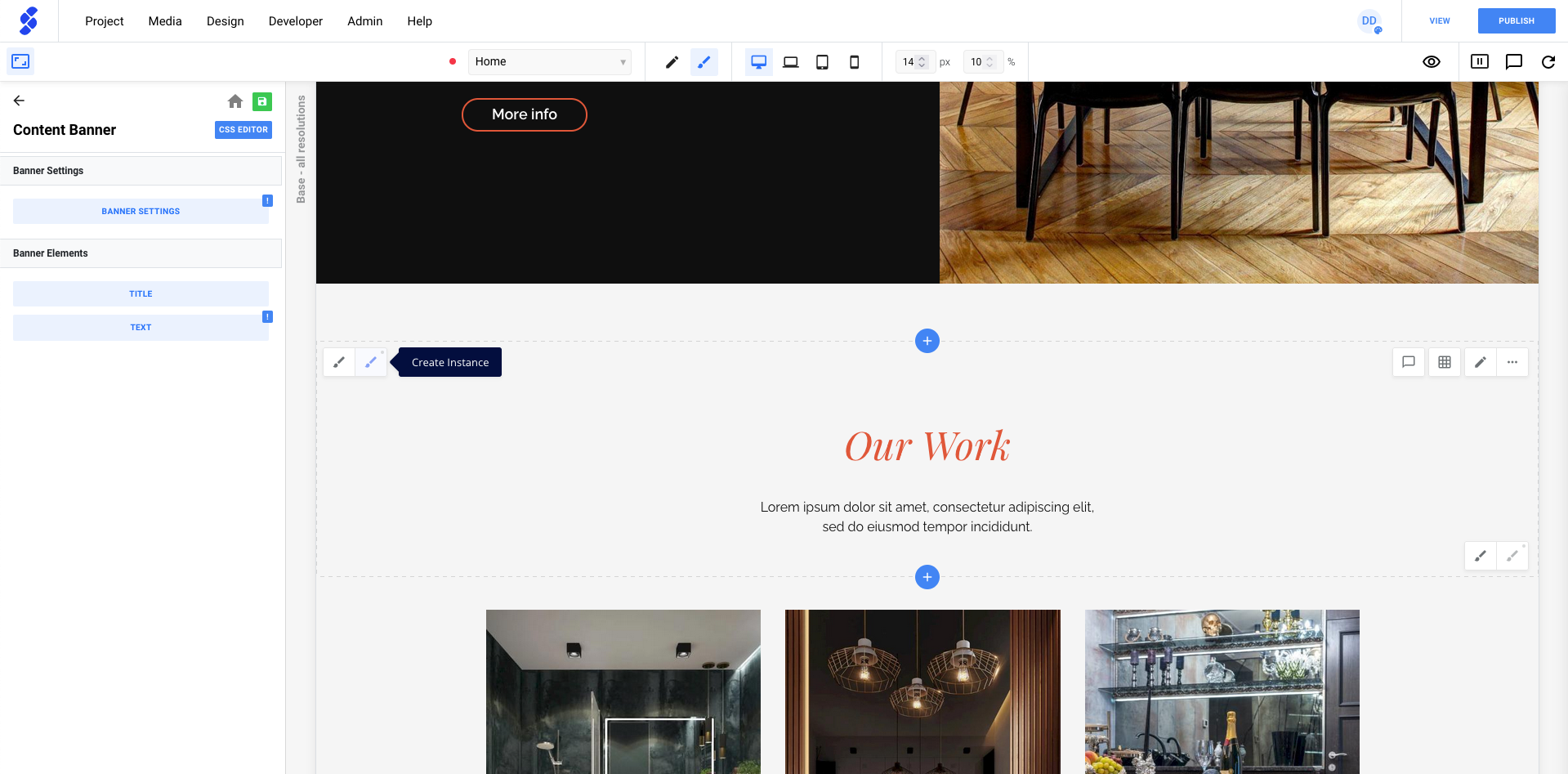
Components that are instances will have a second blue pencil. Clicking that icon will allow you to make changes to the instance.