You can use the following menu to navigate through this article
- Introduction
- Default Breakpoint Settings
- How to Edit a Breakpoint
- Manage Breakpoint Panel
- Component Breakpoints
Introduction

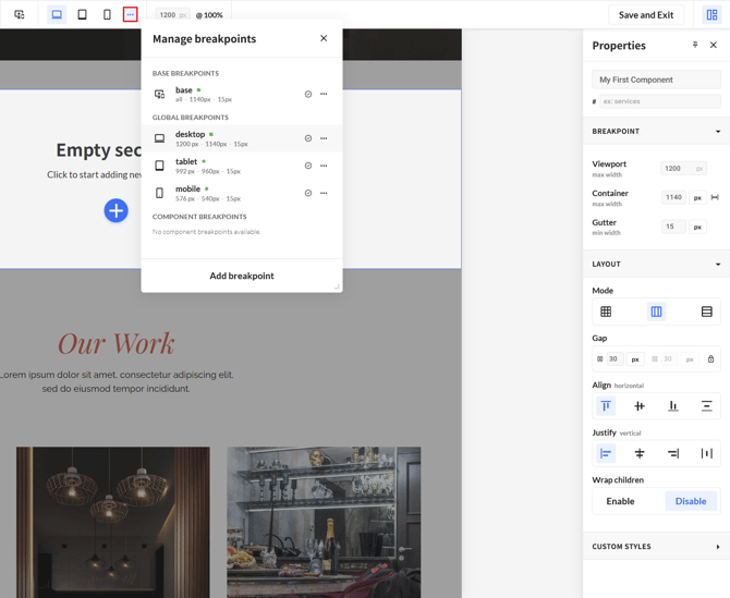
At the top of the No-Code Editor, we will find the breakpoints. These can be used to view how your components looks on smaller screen:
- Base: your default breakpoint used for laptops
- Desktop: the breakpoint used for desktop & large screens
- Tablet: the breakpoint used for tablets
- Mobile: the breakpoint used for phones
- Manage Breakpoints: This will open a panel to tweak the breakpoints
Breakpoints come in two kinds:
-
Global breakpoints exist across your whole project. Base, Desktop, Tablet and Mobile are global breakpoints. A global breakpoint can be in use in a component or not, and can be marked as a default.
-
Component breakpoints exist only inside the component you create them in. You make them yourself when the standard breakpoints don't cover the screen width you need.
Default Breakpoint Settings
Every component comes with a set of default settings for the container & gutter, in our newly made component we see the following default values, you can view more details by clicking the "three dots" (see the screenshot below):
Base:
The base breakpoint uses a container of: 1140px with a gutter of 15px and applies to a viewport between tablet & desktop
Desktop:
The desktop breakpoint uses a container of: 1140px with a gutter of 15px and applies to a viewport of 1200px and larger
Tablet:
The tablet breakpoint uses a container of: 990px with a gutter of 15px and applies to a viewport between mobile & 992px
Mobile:
The mobile breakpoint uses a container of: 540px with a gutter of 15px and applies to a viewport up to 576px
These four breakpoints are set as default global breakpoints, these are already active in every new component.
You can change which breakpoints are defaults from the Manage breakpoints panel - see Set as default.
How to Edit a Breakpoint
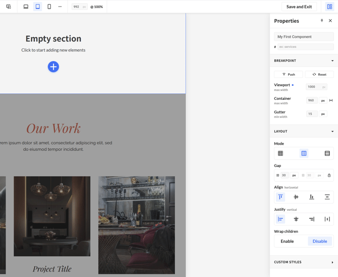
When we select the viewport we want to edit, we can click the icon at the top. In the example below, we chose to edit the Tablet viewport. On the righthand side, in the Properties panel, we can change the breakpoint. In our example it has been changed to 1000px, to confirm a change, press enter.
Once changed, a blue dot will appear indicating that we have changed the breakpoint.
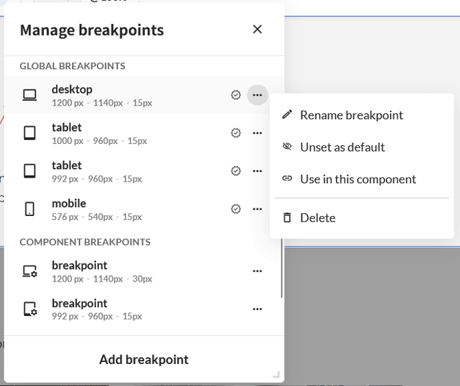
In the Manage breakpoints panel, we will also see that our changes have been highlighted. In this case the first item will be highlighted in blue. The same applies to if we were to change the other values like Container Gutter it'll be highlighted with a blue color to indicate the changes
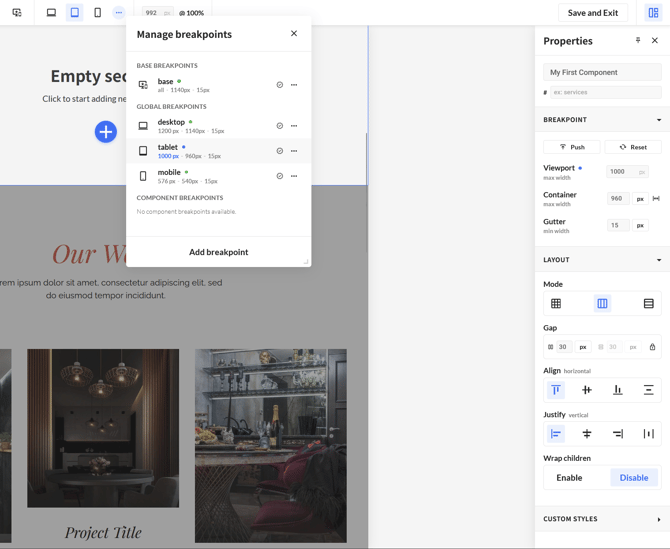
Breakpoint properties
Open the breakpoint settings and you can edit the following properties.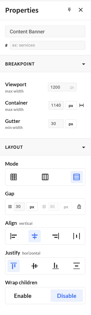
Viewport:
The screen width at which this breakpoint starts to apply. Type a new value and press enter to confirm.
Container:
The maximum width of your content. You can set it in px, % or rem. You can also set the container to **full width** with the button on the right, which lets your content run edge to edge instead of being capped at a fixed width.
Gutter:
The spacing on the inside of the container. Like the container, the gutter can be set in px, % or rem.
Gap (In the screenshot you can find this option under Layout):
The spacing between columns and rows. By default the gap is locked, so the value you type applies to both at once. Click Unlock to set the column gap and the row gap to different values.
Push & Reset
As soon as you change a value on a global breakpoint, two buttons appear right above Viewport in the Properties panel:
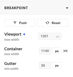
-
Push: applies your values to the global breakpoint, across the whole project.
-
Reset: puts this breakpoint back to the global values, in this component only.
These are the same actions as *Push changes to global* and *Reset to global values* in the Manage breakpoints panel, so you can use whichever panel you are already in.
Resetting a property
Breakpoints inherit their values from the breakpoint above them: if you don't set a value on Tablet, it uses the value of Base.
On every breakpoint (except Base), a property that has its own value gets a reset button next to it.
The gap is a good example: as soon as you give it a value on Tablet, the reset button appears. Click it and the value is cleared, and the property inherits from the breakpoint above it again.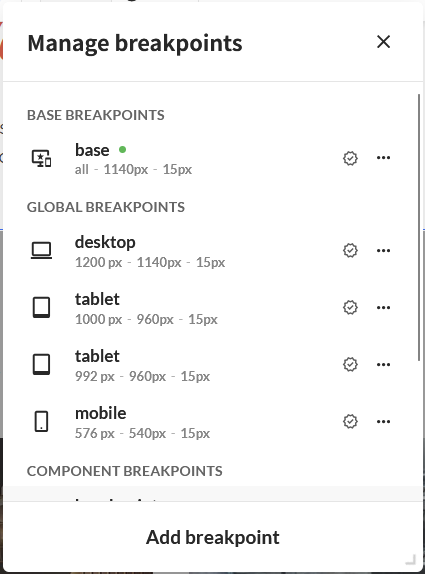
On every breakpoint except Base, a property that has its own value gets a reset button next to it.
The gap is a good example: as soon as you give it a value on Tablet, the reset button appears. 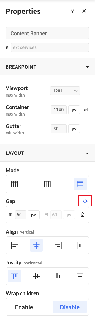
You can reset this value by clicking on this icon.
Manage Breakpoints Panel
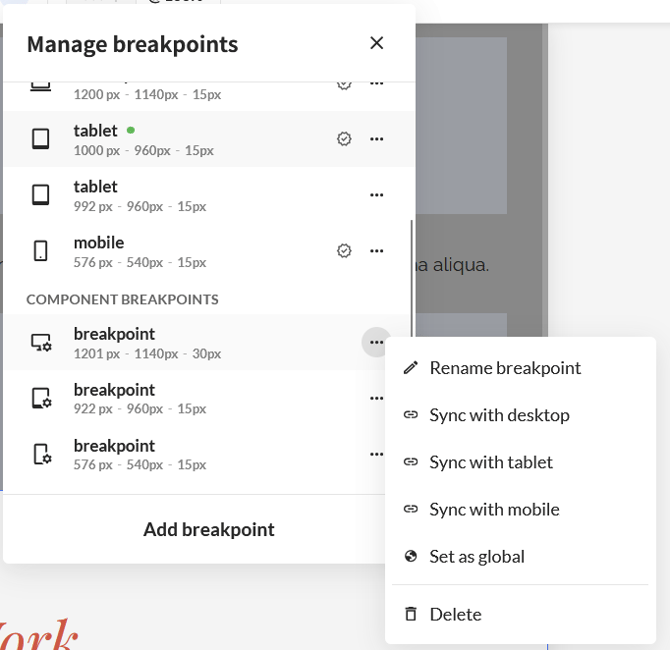
The Manage breakpoints panel is where you manage the breakpoints of your component. When you change a value on a global breakpoint, the change is highlighted in blue here, exactly like in the Properties panel we saw earlier.
Once a global breakpoint has changes, these options become available:
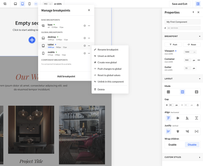
- Push changes to global
- Reset to global values
- Create new global
- Unlink in this component
And regardless of whether you changed anything:
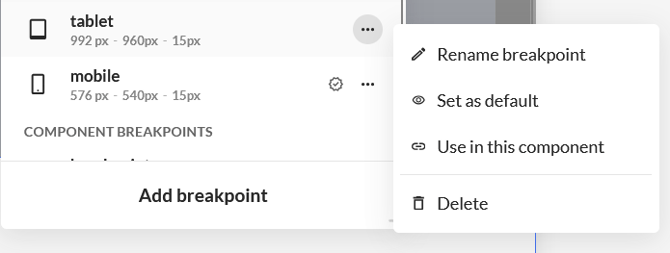
- Set as default
- Use in this component
Push changes to global
Push saves the values you changed to the global breakpoint itself. The new values apply to this breakpoint throughout the entire project, so every component that uses this global breakpoint will use it.
Reset to global values
When you want to undo your change and revert back to the global default values, you can use this option. Reset only affects this component. The global breakpoint itself and every other component that uses it stay untouched.
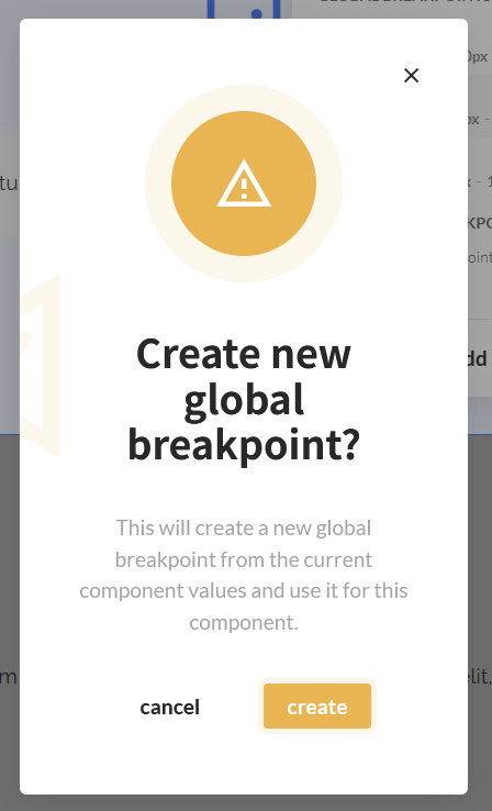
Create new Global
Creates a brand new global breakpoint using the settings you adjusted. The original global breakpoint keeps its own values, and the new breakpoint is available across the project. If you also want it to be switched on automatically in new components, mark it as a default.
Unlink in this component
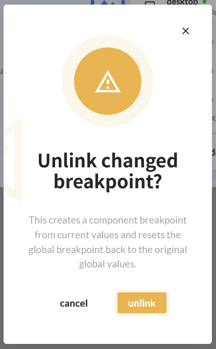
Unlink turns your changed global breakpoint into a component breakpoint. Three things happen when unlinking a component:
-
A component breakpoint is created with your adjusted values and settings.
-
The global breakpoint is reset to its original values.
-
The global breakpoint is no longer in use in this component. You can bring it back at any time with Use in this component.
Use this when a component needs to behave differently at a certain width, but you don't want to change that breakpoint for the rest of the project.
Set as default
Any global breakpoint can be set as a default, or unset again. Default global breakpoints are the ones that are already active when you create a new component. Unsetting a default doesn't remove the breakpoint or affect existing components - it only means new components start without it.
Use in this component
A global breakpoint that isn't in use in your component is still listed in the Manage breakpoints panel. Click **Use in this component** to switch it on, and the component starts responding to that breakpoint.
Component Breakpoints
Creating a component breakpoint
Click Add breakpoint in the Manage breakpoints panel. The breakpoint is created inside the component you are working in, and it can only be used there. Set its viewport, container, gutter and gap the same way you would for any other breakpoint.
Turning a component breakpoint into a global breakpoint
If a component breakpoint turns out to be useful elsewhere, you can set it as a global breakpoint. It then becomes available throughout the project, and you can use it in other components like any other global breakpoint.
Syncing a component breakpoint with a global breakpoint
You can sync a component breakpoint with any global breakpoint that isn't in use in this component. This is useful when you built a component breakpoint that turns out to do roughly the same job as a global one, and you would rather keep the project consistent.
When you sync:
-
The breakpoint settings of your component breakpoint are overwritten by the settings of the global breakpoint.
-
From that point on, the component uses the global breakpoint.
-
Everything else you had set on your component breakpoint is kept.