---
title: Creating your own component(s) with the No-Code Editor
description: Learn how to create your own components using the No-Code Editor
---
[Skip to content](https://support.sitemanager.io/en/no-code-editor/getting-started/creating-your-own-components-with-the-no-code-editor#main-content)
[](https://support.sitemanager.io/en?hsLang=en)
Open main navigation
Close main navigation
- [Go to sitemanager.io](https://www.sitemanager.io/)
[Go to sitemanager.io](https://www.sitemanager.io/)
How can we help?
- There are no suggestions because the search field is empty.
1. [Knowledge Base](https://support.sitemanager.io/en?hsLang=en)
2. [No-Code Editor](https://support.sitemanager.io/en/no-code-editor?hsLang=en)
3. [Getting Started](https://support.sitemanager.io/en/no-code-editor?hsLang=en#getting-started)
# Creating your own component(s) with the No-Code Editor
## This article will explain how the No-Code Editor works, and how we can create our own responsive component(s)
You can use the following menu to navigate through this article
- [Layers](https://support.sitemanager.io/en/no-code-editor/getting-started/creating-your-own-components-with-the-no-code-editor#layers)
- [Properties](https://support.sitemanager.io/en/no-code-editor/getting-started/creating-your-own-components-with-the-no-code-editor#properties)
- [Breakpoints](https://support.sitemanager.io/en/no-code-editor/getting-started/creating-your-own-components-with-the-no-code-editor#breakpoints)
- [Custom Styles](https://support.sitemanager.io/en/no-code-editor/getting-started/creating-your-own-components-with-the-no-code-editor#properties-customstyles)
- [Adding blocks to our component](https://support.sitemanager.io/en/no-code-editor/getting-started/creating-your-own-components-with-the-no-code-editor#adding-blocks-to-our-component)
---
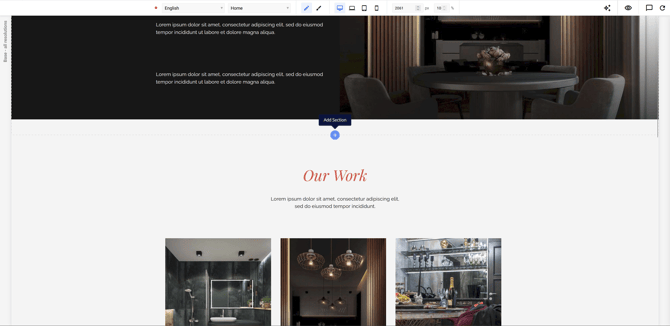
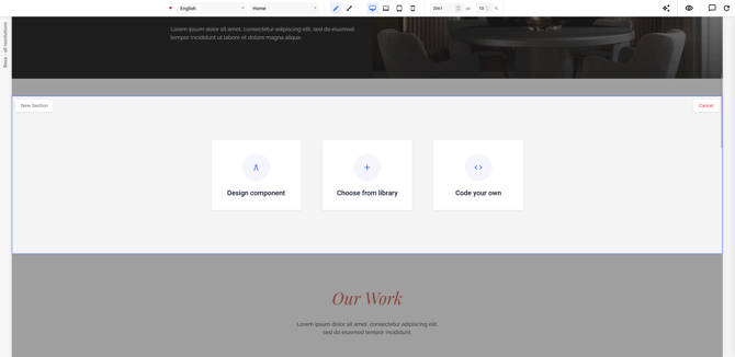
To create your a component, click on the "+" icon. This will show you three options:
- Design Component
- Choose from Library
- Code your own
In this article, we'll focus on **Design Component**. This will show you a popup to give your component a name.
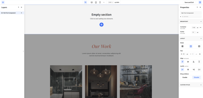
Once created, the No-code Editor will open, we can now start creating our very own component!
### Layers
On the left hand side you will find the Layers panel.
The plus icon next the name of our component (f.e. My First Component), will show all the available building blocks that you can use to create your own component.
You can select the block you want to work on. Click a block here and its settings open in the Properties panel on the right.
The Layers panel is also where you add new blocks, which is covered in the section: [Adding Blocks to our component](https://support.sitemanager.io/en/no-code-editor/getting-started/creating-your-own-components-with-the-no-code-editor#adding-blocks-to-our-component)
### Properties
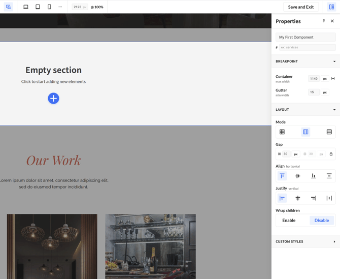
On the right hand side you will find the Properties panel. This panel lets you change the design settings of whichever block you have selected.
#### Layout
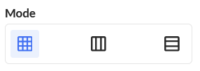
In this section you can change how your component positions and aligns the blocks inside it. You can choose between three layout modes:
- [Grid](https://support.sitemanager.io/en/no-code-editor/getting-started/creating-your-own-components-with-the-no-code-editor#properties-layout-grid)
- [Horizontal Flex](https://support.sitemanager.io/en/no-code-editor/getting-started/creating-your-own-components-with-the-no-code-editor#properties-layout-flex-horizontalflex)
- [Vertical Flex](https://support.sitemanager.io/en/no-code-editor/getting-started/creating-your-own-components-with-the-no-code-editor#properties-layout-flex-verticalflex)
For these three options, we already some blocks to showcase every options. Adding these blocks will be explained in more detail in a later section of this article
To build our components mobile-first we recommend using the Flexbox principle. They adapt to the width that is available more easily than a fixed grid does.
We recommend checking out the [Complete Guide on CSS-Tricks](https://css-tricks.com/snippets/css/a-guide-to-flexbox/)
##### Grid
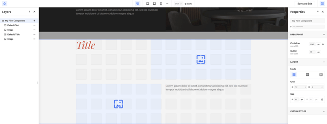
Use Grid when you want to place your blocks in a clear structure of rows and columns. You set how many rows and columns you need, and then place each block exactly where you want it.
See the [Grid article](https://support.sitemanager.io/en/no-code-editor/properties/grid?hsLang=en) to learn how to edit the grid properties in more detail.
---
##### Horizontal Flex
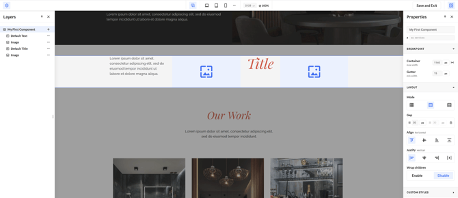
Horizontal Flex arranges your blocks in a row, next to each other. Use it for content that reads
across the page, such as a row of cards.
You can use [this article](https://support.sitemanager.io/en/no-code-editor/properties/flex?hsLang=en) to learn how to edit the flex properties even further
##### Vertical Flex
Vertical Flex stacks your blocks on top of each other, from top to bottom. Use it for content that
reads as a column, such as a title with a paragraph and a button underneath it.
You can use [this article](https://support.sitemanager.io/en/no-code-editor/properties/flex?hsLang=en) to learn how to edit the flex properties even further
#### Custom Styles
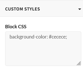
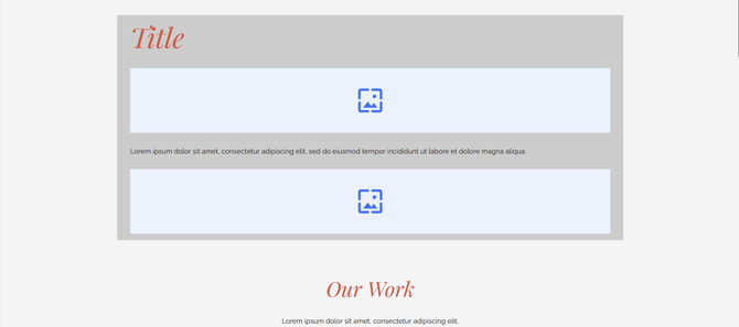
Custom Styles lets you apply your own CSS to a component, for anything the other settings do not cover. In the example below we use `background-color: #cecece` to give the component a custom
background colour.
### Breakpoints
When creating a component, you can check what it looks like on each breakpoint: Base, Desktop, Tablet and Mobile.

See the *[Breakpoints article](https://support.sitemanager.io/en/no-code-editor/advanced/breakpoints?hsLang=en)* for what each breakpoint does and how to change its settings.
### Adding blocks to our component
To add a new block, click the "+" icon in the Layers panel, or the blue "+" icon underneath Empty Section.
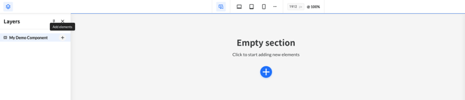
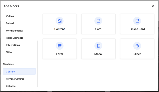
This opens a popup with all the blocks you can use, such as Text, Titles, Buttons, Images and Videos.
You can also group blocks together to keep your component easier to maintain. Grouping is done with Structures, which you will find at the bottom of that same popup. There are several to choose from, such as Content and Card.
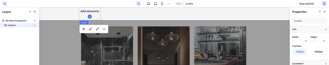
After adding a structure such as Content, click the "+" icon on that structure to add blocks to it.
In this example we add a Default Text and a Default Title to our Content structure.
You can then click the structure in the Layers panel to adjust it further. In the image below we
changed the layout from Horizontal Flex to Vertical Flex, which gives us the final result.
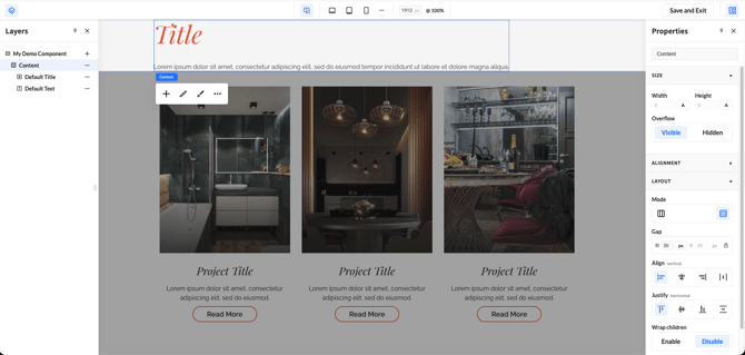
To leave the No-Code Editor, click Save and Exit.
- [Getting Started](https://support.sitemanager.io/en/getting-started?hsLang=en)
- [Dashboard](https://support.sitemanager.io/en/dashboard?hsLang=en#main-content)
- [Getting Started](https://support.sitemanager.io/en/dashboard?hsLang=en#getting-started)
- [Project Dashboard](https://support.sitemanager.io/en/dashboard?hsLang=en#project-dashboard)
- [White Label & Add-ons](https://support.sitemanager.io/en/dashboard?hsLang=en#white-label-add-ons)
- [Account](https://support.sitemanager.io/en/account?hsLang=en#main-content)
- [Account Settings](https://support.sitemanager.io/en/account?hsLang=en#account-settings)
- [My Company](https://support.sitemanager.io/en/account?hsLang=en#my-company)
- [Subscription](https://support.sitemanager.io/en/account?hsLang=en#subscription)
- [Project](https://support.sitemanager.io/en/project?hsLang=en#main-content)
- [General](https://support.sitemanager.io/en/project?hsLang=en#general)
- [Upgrade Project](https://support.sitemanager.io/en/project?hsLang=en#upgrade-project)
- [SEO](https://support.sitemanager.io/en/seo?hsLang=en#main-content)
- [Basics](https://support.sitemanager.io/en/seo?hsLang=en#basics)
- [Advanced](https://support.sitemanager.io/en/seo?hsLang=en#advanced)
- [Go Live](https://support.sitemanager.io/en/go-live?hsLang=en#main-content)
- [Prepare Project](https://support.sitemanager.io/en/go-live?hsLang=en#prepare-project)
- [Prepare Domain](https://support.sitemanager.io/en/go-live?hsLang=en#prepare-domain)
- [Going Live](https://support.sitemanager.io/en/go-live?hsLang=en#going-live)
- [Advanced](https://support.sitemanager.io/en/go-live?hsLang=en#advanced)
- [Content](https://support.sitemanager.io/en/content?hsLang=en#main-content)
- [Getting Started](https://support.sitemanager.io/en/content?hsLang=en#getting-started)
- [Page Management](https://support.sitemanager.io/en/content?hsLang=en#page-management)
- [Content Management](https://support.sitemanager.io/en/content?hsLang=en#content-management)
- [Language Management](https://support.sitemanager.io/en/content?hsLang=en#language-management)
- [Image Library](https://support.sitemanager.io/en/content?hsLang=en#image-library)
- [Collaborating on a project](https://support.sitemanager.io/en/content?hsLang=en#collaborating-on-a-project)
- [Page Components](https://support.sitemanager.io/en/page-components?hsLang=en#main-content)
- [Getting Started](https://support.sitemanager.io/en/page-components?hsLang=en#getting-started)
- [HTML](https://support.sitemanager.io/en/page-components?hsLang=en#html)
- [CSS](https://support.sitemanager.io/en/page-components?hsLang=en#css)
- [JavaScript (JS)](https://support.sitemanager.io/en/page-components?hsLang=en#javascript-js)
- [How To](https://support.sitemanager.io/en/page-components?hsLang=en#how-to)
- [Layout Components](https://support.sitemanager.io/en/layout-components?hsLang=en)
- [No-Code Editor](https://support.sitemanager.io/en/no-code-editor?hsLang=en#main-content)
- [Getting Started](https://support.sitemanager.io/en/no-code-editor?hsLang=en#getting-started)
- [Properties](https://support.sitemanager.io/en/no-code-editor?hsLang=en#properties)
- [Advanced](https://support.sitemanager.io/en/no-code-editor?hsLang=en#advanced)
- [Design](https://support.sitemanager.io/en/design?hsLang=en#main-content)
- [Overview](https://support.sitemanager.io/en/design?hsLang=en#overview)
- [Design editor](https://support.sitemanager.io/en/design?hsLang=en#design-editor)
- [Design Panels](https://support.sitemanager.io/en/design?hsLang=en#design-panels)
- [Responsive](https://support.sitemanager.io/en/design?hsLang=en#responsive)
- [Fonts](https://support.sitemanager.io/en/design?hsLang=en#fonts)
- [Layouts](https://support.sitemanager.io/en/design?hsLang=en#layouts)
- [Code](https://support.sitemanager.io/en/code?hsLang=en#main-content)
- [Introduction](https://support.sitemanager.io/en/code?hsLang=en#introduction)
- [Token Management](https://support.sitemanager.io/en/code?hsLang=en#token-management)
- [Project Setup](https://support.sitemanager.io/en/code?hsLang=en#project-setup)
- [ToolStack](https://support.sitemanager.io/en/code?hsLang=en#toolstack)
- [Private Library](https://support.sitemanager.io/en/code?hsLang=en#private-library)
- [Dynamic Content](https://support.sitemanager.io/en/dynamic-content?hsLang=en#main-content)
- [Getting started](https://support.sitemanager.io/en/dynamic-content?hsLang=en#getting-started)
- [Basics](https://support.sitemanager.io/en/dynamic-content?hsLang=en#basics)
- [Advanced](https://support.sitemanager.io/en/dynamic-content?hsLang=en#advanced)
- [External Content](https://support.sitemanager.io/en/external-content?hsLang=en#main-content)
- [Getting started](https://support.sitemanager.io/en/external-content?hsLang=en#getting-started)
- [Configuration & implementation](https://support.sitemanager.io/en/external-content?hsLang=en#configuration-implementation)
- [Logic (Smart Content)](https://support.sitemanager.io/en/logic-smart-content?hsLang=en#main-content)
- [Getting Started](https://support.sitemanager.io/en/logic-smart-content?hsLang=en#getting-started)
- [Configuration & Implementation](https://support.sitemanager.io/en/logic-smart-content?hsLang=en#configuration-implementation)
- [Logic](https://support.sitemanager.io/en/logic-smart-content?hsLang=en#logic)
- [AB testing](https://support.sitemanager.io/en/logic-smart-content?hsLang=en#ab-testing)
- [Timed Content](https://support.sitemanager.io/en/logic-smart-content?hsLang=en#timed-content)
- [Password Protected Content](https://support.sitemanager.io/en/logic-smart-content?hsLang=en#password-protected-content)
- [Smart API](https://support.sitemanager.io/en/logic-smart-content?hsLang=en#smart-api)
- [Integrations](https://support.sitemanager.io/en/integrations?hsLang=en#main-content)
- [Getting Started](https://support.sitemanager.io/en/integrations?hsLang=en#getting-started)
- [Integrations](https://support.sitemanager.io/en/integrations?hsLang=en#integrations)
- [Advanced](https://support.sitemanager.io/en/integrations?hsLang=en#advanced)
- [Modules](https://support.sitemanager.io/en/modules?hsLang=en#main-content)
- [Getting Started](https://support.sitemanager.io/en/modules?hsLang=en#getting-started)
- [Modules](https://support.sitemanager.io/en/modules?hsLang=en#modules)
- [Upgrade Center](https://support.sitemanager.io/en/upgrade-center?hsLang=en#main-content)
- [Components](https://support.sitemanager.io/en/upgrade-center?hsLang=en#components)
- [Forms](https://support.sitemanager.io/en/forms?hsLang=en#main-content)
- [General](https://support.sitemanager.io/en/forms?hsLang=en#general)
- [Captcha](https://support.sitemanager.io/en/forms?hsLang=en#captcha)
- [Form Actions](https://support.sitemanager.io/en/forms?hsLang=en#form-actions)
- [Extending Forms](https://support.sitemanager.io/en/forms?hsLang=en#extending-forms)
- [Email Templates](https://support.sitemanager.io/en/forms?hsLang=en#email-templates)
- [Advanced](https://support.sitemanager.io/en/forms?hsLang=en#advanced)
- [Cookie Settings](https://support.sitemanager.io/en/cookie-settings?hsLang=en#main-content)
- [Getting Started](https://support.sitemanager.io/en/cookie-settings?hsLang=en#getting-started)
- [Configuration](https://support.sitemanager.io/en/cookie-settings?hsLang=en#configuration)
- [API Call](https://support.sitemanager.io/en/api-call?hsLang=en#main-content)
- [Configuration](https://support.sitemanager.io/en/api-call?hsLang=en#configuration)
[](https://support.sitemanager.io/en?hsLang=en)
Copyright © 2026, SiteManager Group