You can use the following menu to navigate through this article
Introduction
Flex controls how the blocks inside your component are arranged. You set it per block in the
Properties panel, and the option you choose decides whether the blocks inside it sit next to each
other or underneath each other.
This article covers Horizontal Flex and Vertical Flex, and the extra settings that come with them.
Horizontal Flex
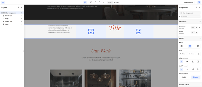
When using Horizontal Flex, the blocks in our component will be arranged in a row next to each other.
This is most useful for most components with horizontal sections, f.e. Cards.
With Horizontal Flex we have 4 additional settings in the Properties Panel
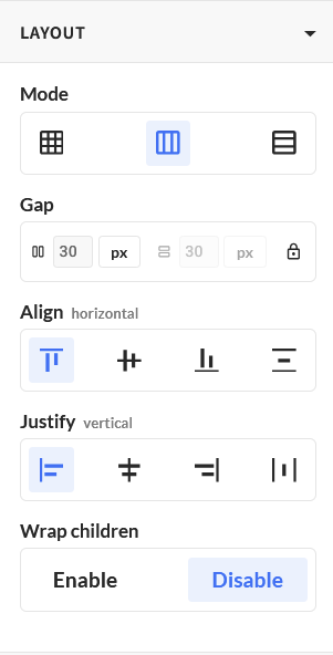
Gap
We can tweak the distance/gap of our block with the Gap setting. By default the rows & columns use the same value (in our screenshot, it's set to 30px). To edit them individually, click the lock icon.
Align
This setting controls how your blocks are positioned within the horizontal row. Specifically, when you have different types of content next to each other (for example an image and a text block), Align lets you decide how they line up:
Start
In the following screenshot we can see that the title block is now at the top of our component

Center
This option will vertically center our title block.

End
In the following screenshot we can see that the title block is now at the bottom of our component

Stretch
Every block is stretched to the height of the tallest one.

Justify
Justify controls how your blocks are spread out along the row, it moves them left and right. This is the setting to use when your blocks do not fill the full width of the component.
Start
The blocks are grouped at the left of the row, with the leftover space on the right.
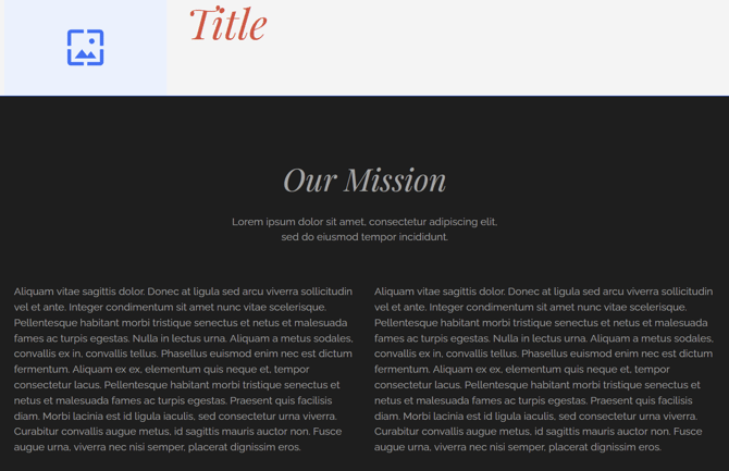
Center
The blocks are grouped in the middle, with the leftover space divided equally on the left
and the right.
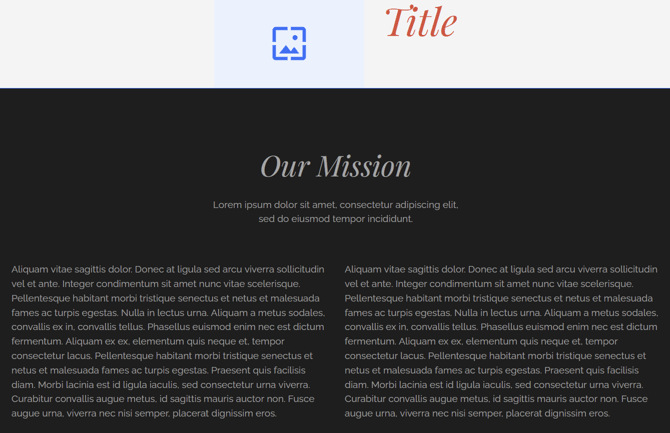
End
The blocks are grouped at the right of the row, with the leftover space on the left.
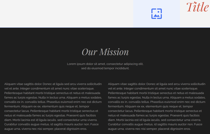
Space Between
The first block sits against the left edge, the last block against the right edge,
and the remaining space is divided equally between the blocks.
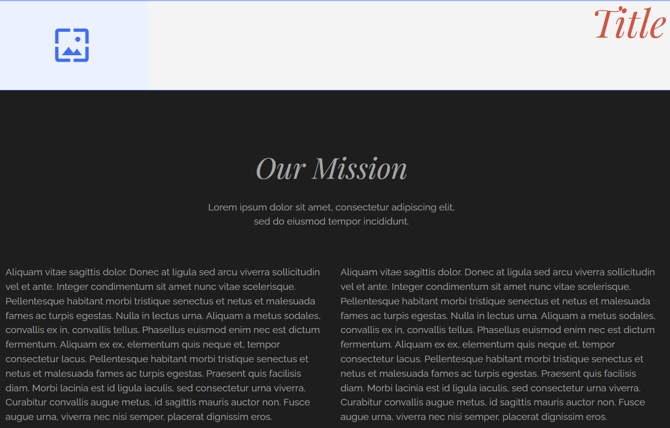
Wrap Children
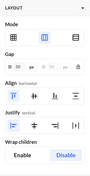
You can use Wrap Children to automatically wrap the items to the next line on smaller screens. For example, if we have a component with 4 cards next to each other, we can use Wrap Children, so the cards will scale better on smaller screens
Vertical Flex
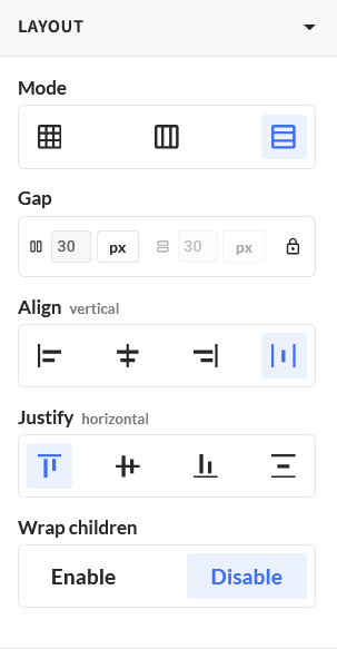
Vertical Flex stacks your blocks on top of each other, from top to bottom. Use it for content that reads as a column, such as a heading with a paragraph and a button underneath it.
Vertical Flex has the same additional settings as Horizontal Flex: Gap, Align, Justify and Wrap Children.
What changes is the direction the two positioning settings work in, because Align and Justify always follow the direction of the flex:
-
In Horizontal Flex, Justify spreads your blocks along the row from left to right, and Align positions them from top to bottom.
-
In Vertical Flex, Justify spreads your blocks down the column from top to bottom, and Align positions them from left to right.