
You can use Grid when you want to place elements in a clear structure of rows and columns.
In our example below, we can see a defined amount of rows and columns. With grid we have the freedom to place our blocks exactly where we want them.
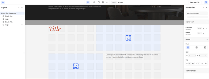
With Grid we have 2 additional settings in the Properties Panel
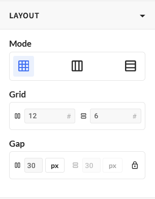
Grid Row & Grid Columns
Grid Row and Grid Columns set how many rows and columns your component is divided into. Together they define the cells you can place your blocks in, so a grid of 3 columns and 2 rows gives you six cells to work with.
Grid gives you precise control, but that control is tied to the number of rows and columns you set.
On a narrow screen, content in a fixed grid can overlap or become hard to read, so always check your component on the smaller breakpoints.
You do not have to use the same layout on every screen size. Layout is set per breakpoint, so you can keep Grid on Base and switch to Horizontal Flex or Vertical Flex on Tablet and Mobile, where content usually just needs to stack.
See Breakpoints for how to change a property for one breakpoint only.
Placing your blocks
Setting the number of rows and columns gives you a set of cells. The next step is deciding which cell each block sits in, and that is where Grid differs from Flex: instead of your blocks following each other in order, you place them exactly where you want them.
Gap
Gap sets the space between the rows and columns of your grid.
By default the gap is locked, so the value you type applies to both the rows and the columns. Unlock it to set the column gap and the row gap separately.