![SM_Platform-logo.png]](https://support.sitemanager.io/hs-fs/hubfs/SM_Platform-logo.png?height=40&name=SM_Platform-logo.png)
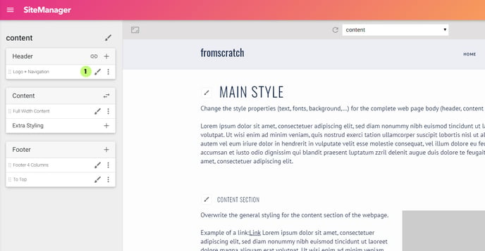
Before we start creating layout variants we are going to check if our layout components react well to different screen sizes. We are using the same steps as described in General Styling
Go to the design app and select the paintbrush style icon for the component you want to change. In this example we are going to double check the font-size of the website title. Click the paintbrush icon (1)
There are 4 viewports: (1) laptop (default), (2) large desktops, (3) tablets and (4) mobile devices. Click the icons to change the values on certain breakpoints, you can change the default breakpoints in your Project Setup.
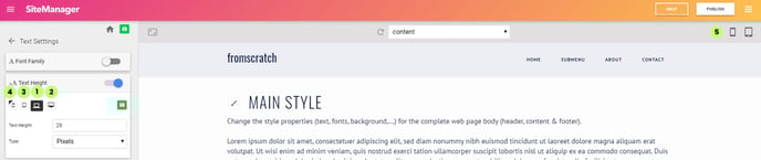
In this example the font-size for mobile is different then other screen sizes. You can see this by the small black corner that's activated in the small icon.
You are able to find preview buttons (5) for every screen size in the right upper corner of the design app.