- Knowledge Base
- Content
- Content Management
Adjust responsive page elements
If we add an item in a specific element, a couple of things are available from start.
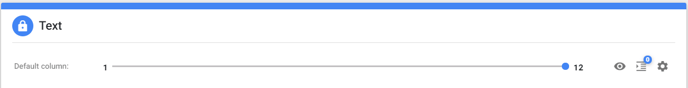
Standard width block (?/12) (slider)
The idea is that the width of content equals a value of 12. In an ideal world, this width is fully being used by the number of elements you want to visualize on one row. The sum of all items, standing on one row, equals 12.
In the screenshot above the widht is being set at 6. This means that the item will fill the left half of the page.
- One item => width 12
- Two items=> width 6 (2 times)
- Three items => width 4 (3 times)
- Four items => width 3 (4 times)
- Six items => width 2 (6 times)
- Twelve items => width 1 (12 times)
Of course this is only a guideline, this values don't have to be set in the exact same way.
Visibility (eye icon)
Used for making one specific item temporarily invisible/visible.
Offset (push columns icon)
The spacing between items can be made larger or smaller by using ofsett.
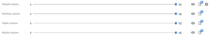
Gear icon
Gear icons or the advanced options are being used to adjust the settings for other devices (desktop, tablet or mobile).
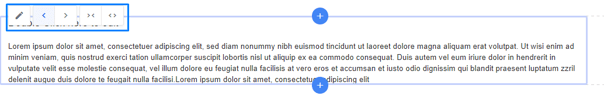
Finally the settings can also be adjusted in the visual interface. The sideways arrows (< & >) can be used to adjust the offset, the (>< & <>) arrows to make the width value increase/decrease by one.