Content block makes it possible to work with a set of different items, using the width of the screen. The width of every item within content block can be set to make combinations you don't have in other page elements.
Default items that can be added:
- Text
- Plugin
- Picture
- Picture + Lightbox popup
- Picture + link
- Responsive iFrame
- YouTube Video
- Google Maps
- Contact form
By editing a component you have the possibility to add new items. Here you can also adjust existing items or delete those which aren't necessary anymore.
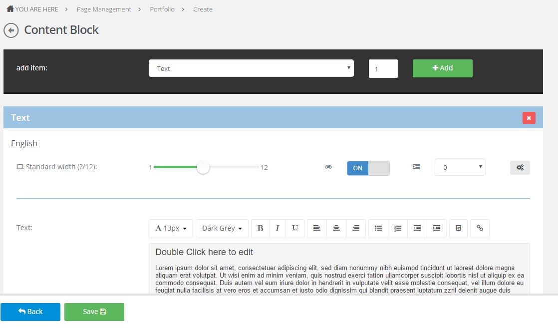
If we add an item in a specific element, mostly a couple of things are available right under the description of the element.
Standard width block (?/12)
The idea is that the width of content equals a value of 12. In an ideal world, this width is fully being used by the number of elements you want to visualize on one row. The sum of all items, standing on one row, equals 12.
In the screenshot above the width is being set at 6. This means that the item will fill the first half of the page.
- One item => width 12
- Two items=> width 6 (2 times)
- Three items => width 4 (3 times)
- Four items => width 3 (4 times)
- Six items => width 2 (6 times)
- Twelve items => width 1 (12 times)
Of course this is only a guideline, this values don't have to be set in the exact same way.
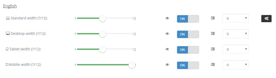
Visibility
Used for making one specific item temporarily invisible/visible.
Offset
The spacing between items can be made larger or smaller by using ofsett.
Gear icon
Gear icons or the advanced options are being used to adjust the settings for other devices (desktop, tablet or mobile).
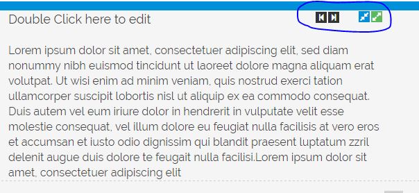
Finally the settings can also be adjusted in the visual interface. The black arrows are being used to adjust the ofsett, the blue and green arrow to make the width value increase/decrease by one.