![SM_Platform-logo.png]](https://support.sitemanager.io/hs-fs/hubfs/SM_Platform-logo.png?height=40&name=SM_Platform-logo.png)
In this article
- Analyze component design
- Build your component
- Convert to a repeater component
- Add content
- Reuse components
Analyze component design
Before starting to build a repeater component, it is useful to first analyze its design structure. To make your component as reusable as possible, it's worth considering adding elements you don't need right now, but may use in the future.
Think of it as collecting Lego blocks to build your house, and perhaps not using them all but having them available nonetheless. Good examples of such elements you may want to add are Titles, Text, Image, Button, etc.
After all, reusability and flexibility are one of the main advantages of using repeaters. Don't worry about elements adding in the design engine that you won't end up using. It's only when you start adding content through the Content Editor that you decide what your component will look like.
Build your component
After conceptualizing your component design, build your component in the design engine. Depending on your component design, it's recommendable to use with structures.
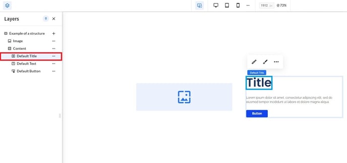
Example:
Even if you don't need a Default Title in your component you're building right now, it's a good idea to add it while building in the design engine if you think you may need it in the future.
Convert to a repeater component
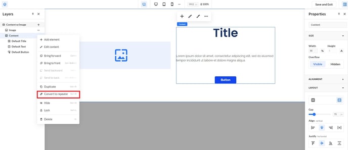
Next, go to the Design View by clicking the paint brush icon in the second navigation bar. Also open the design engine panel on the right side withe grid icon and the layers panel on the left side with the layers icon.
Apply the repeater feature to your component by:
- clicking the right mouse button while hovering your component;
- clicking the three dots in the layer panel and select Convert to repeater;
- hitting shortcut keys, Ctrl + R.
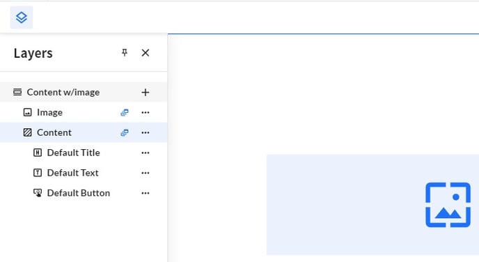
When you successfully apply the converter to your component, the repeater icon appears next to the corresponding component (element) in the layers panel.
Note:
Notice how layers on the same level automatically become repeater component(s) (elements), and how you can use repeaters both on parent and child level of the component for optimal interchangeability.
Add content
After saving your design settings, you're automatically redirected to the Content View - as you can see by the pencil icon in the second navigation bar. Add content to your repeater component, either by clicking the in-line or the component pencil icon. This will take you to the Content Editor.
Important:
As soon as you hit the Save and Exit button in the left design engine panel, it may appear as if your component disappeared. Fortunately, it only seems this way.
Since you switched your component's initially unchangeable format to a flexible and interchangeable, the CMS no longer follows the prebuilt content format. As a result, your component content is empty
To "fix" your component, simply add the content you wish to display.
Add new element(s)
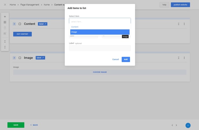
Click the plus icon in the left toolbar of the Content Editor to add content elements.
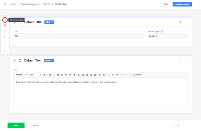
Choose which items you need from the elements you previously included in the design engine by selecting them from the dropdown menu. You can easily add them one or multiple times in one go to save time.
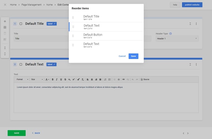
Organize elements
Clicking any three dots on the right side of an element window in the Content Editor, to copy, move or delete elements.
Note:
On the left side of each component element, the padlock icon has been swapped for a checkbox.
Reuse components
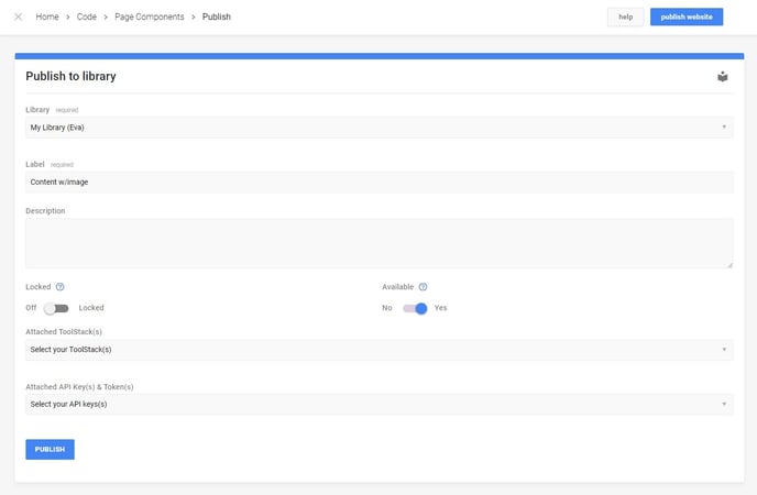
Reuse a repeater component - something that we highly recommend - by clicking the right mouse button while hovering your component and selecting Save To Library.
Next, add a section to your page, and select Choose from Library to add your component. Finally, update the content and add, move and/or delete the items to your liking. Voilà, you're done!